The Philadelphia Eagles are one of the most iconic franchises in the NFL, known for their passionate fan base, hard-hitting style of play, and distinctive midnight green branding. Over the decades, the Eagles’ logo has undergone several changes, reflecting the team’s evolution and branding strategy.
This article explores the entire history of the Philadelphia Eagles logo, from its origins in 1933 to the modern-day emblem, along with an analysis of its design elements and cultural significance.
Origins of the Philadelphia Eagles Logo (1933-1935)
![]()
The Philadelphia Eagles were established in 1933 as a replacement for the defunct Frankford Yellow Jackets. The team took inspiration from the National Recovery Administration (NRA) emblem, a part of Franklin D. Roosevelt’s New Deal program.
Design Elements of the 1933 Logo
- Featured a blue eagle in flight, carrying a football in its talons.
- The NRA eagle represented strength, recovery, and resilience during the Great Depression.
- The color scheme was blue and white, different from today’s midnight green.
This logo set the foundation for the team’s identity, linking it to American patriotism and strong values.
Introduction of Green & a Sleeker Look (1936-1942)
![]()
In 1936, the Eagles redesigned their logo with a significant change:
- Green became the official team color, replacing blue.
- The eagle’s design became sleeker and more defined, with extended wings.
- The football remained in the eagle’s talons, keeping the connection to the sport.
This change made the logo more visually striking, aligning it with the team’s emerging identity.
The 1943 Black-and-White Steagles Logo
![]()
In 1943, due to World War II, both the Philadelphia Eagles and Pittsburgh Steelers merged for one season, forming the Steagles. As a result, the Eagles’ iconic green logo was replaced with a black-and-white version.
The Return of Green (1944-1947)

After the brief Steagles merger, the Eagles introduced a new, refined logo in 1944. This version featured a bold, stylized eagle with outstretched wings, symbolizing resilience and strength.
Design Features:
- The eagle was more detailed, giving it a sharper, cleaner look.
- The football remained a central element, reinforcing the team’s identity.
- This logo lasted until 1947, when a modernized version was introduced.
This period marked the Eagles’ transition into a dominant post-war franchise, setting the stage for future success.
The 1948 Championship Era Logo (1948-1968)
![]()
By 1948, the Eagles had built a dominant franchise, winning their first NFL Championship. To mark their growing stature, the team revamped its logo:
- The eagle was more detailed and symmetrical.
- The wingspan was extended to create a wider, more balanced look.
- The football remained a core element in the design.
This logo became iconic as the Eagles won NFL Championships in 1948 and 1949, solidifying their reputation as one of the top teams of the era.
A Minimalist Experiment (1969-1972)
In a surprising move, the Eagles simplified their logo in 1969, opting for:
- A plain green outline of an eagle instead of a detailed design.
- A more abstract representation of flight and motion.
- No football, making it less directly tied to football imagery.
This design, while modern for its time, failed to resonate with fans. It was short-lived, lasting only until 1972.
The Transition to a Modern Look (1973-1986)
![]()
In 1973, the Philadelphia Eagles introduced a new helmet logo, replacing the full-bodied eagle with sleek, silver wings on a green helmet. This design marked a significant shift towards a modern and minimalist aesthetic.
Design Highlights:
- The full eagle holding a football was removed, replaced by stylized silver wings on the helmet.
- The wings featured a sharp, aerodynamic design, giving a sense of speed and motion.
- This design became a signature look for the Eagles for over a decade, maintaining consistency until 1986.
This helmet logo became one of the most recognizable symbols in the NFL and set the stage for further modernizations in the late 1980s and beyond.
The 1987-1995 Refined Eagle Design
In 1987, the Eagles slightly refined their logo, making the eagle look more dynamic and fierce. The eagle is back with a sharper look, featuring a more streamlined and modern design while still holding a football.
Design Highlights:
- The wings were more extended and detailed.
- The eagle’s expression became more aggressive, reflecting the team’s competitive nature.
- This was the final full-bodied eagle logo before switching to the current head-only design.
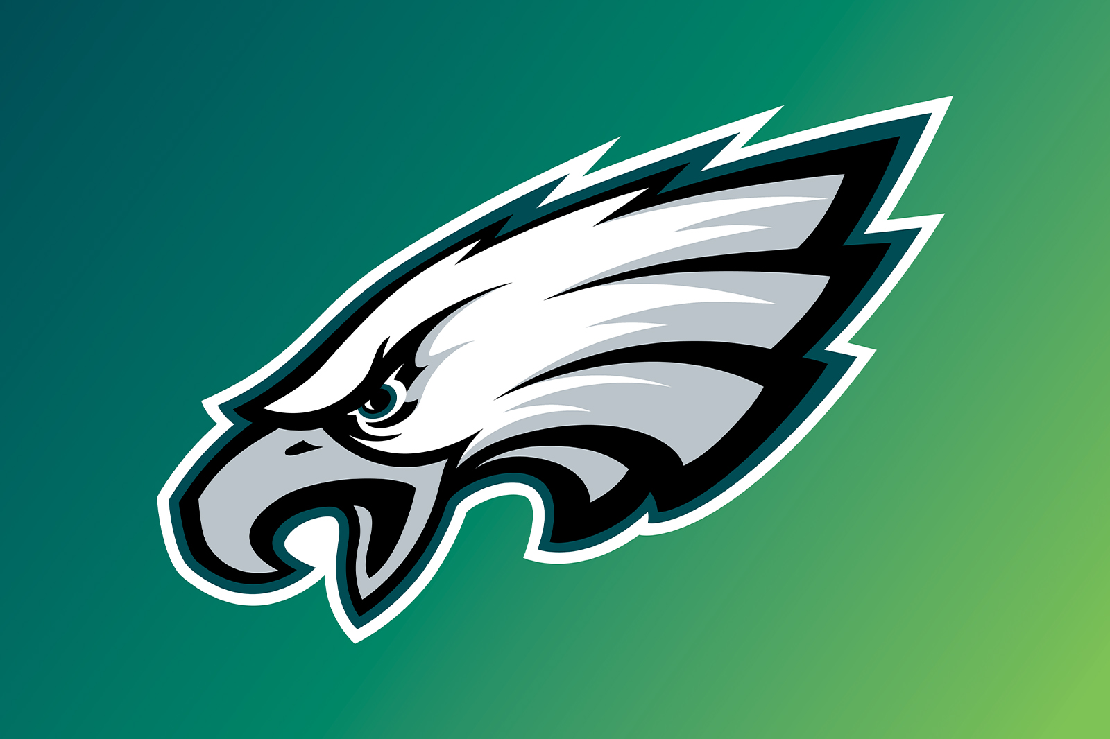
The Birth of the Modern Eagles Logo (1996-Present)
![]()
In 1996, the Philadelphia Eagles made a bold branding move by completely redesigning their logo into the modern eagle head emblem.
Key Features of the 1996 Logo:
- Eagle Head Instead of a Full-Body Eagle: A more aggressive, streamlined design.
- Midnight Green, Silver, and Black Color Scheme: A darker, modern aesthetic.
- Hidden “E” Shape: The eagle’s curved beak subtly forms an “E”, a brilliant branding move.
This logo has lasted over 25 years, becoming one of the most recognizable in all of sports. It was the symbol of the Eagles’ Super Bowl LII victory in 2018, their first championship win in the modern era.
Analyzing the Philadelphia Eagles Logo Design
1. The Power of the Eagle Symbol
The eagle represents power, freedom, and dominance, aligning with the team’s gritty and tough identity.
2. The Evolution of Color
- Early logos featured blue and white.
- Green was introduced in 1936 and has remained ever since.
- The midnight green of 1996 added a modern, fierce tone.
3. The Shift from Traditional to Modern
- Early logos were classic, traditional emblems.
- The 1996 redesign introduced a minimalist yet aggressive identity.
- The subtle “E” shape within the modern logo shows brilliant branding.
Will the Eagles Change Their Logo Again?
With many NFL teams rebranding their logos, speculation exists that the Eagles could introduce a new design in the future. However, as of now, the Eagles seem content with their current look.
Potential future changes might include:
✔ A more detailed eagle head with modern design techniques.
✔ A throwback full-body eagle, paying tribute to past logos.
✔ A 3D-style logo, similar to recent NFL rebrands.
Only time will tell whether the Eagles will update their beloved emblem.
Explore More About the Eagles & the NFL
📌 Philadelphia Eagles Official Website – Stay updated with the latest Eagles news, schedules, and team updates.
📌 NFL Official Website – Get league-wide news, scores, and insights from around the NFL.
Need a Custom Logo for Your Brand?
Are you looking for a bold, professional logo like the Eagles’ iconic emblem?
We at DigiHexagon specialize in high-quality logo design that builds a strong brand identity. Get your custom NFL-style logo today! 🚀
Final Thoughts
The Philadelphia Eagles logo has evolved from a simple blue eagle in 1933 to the fierce midnight green emblem used today. Each redesign reflects the team’s growth and success, making it one of the most recognizable logos in sports history.
If you found this article useful, be sure to share it and check out our professional logo design services!

 (484) 778-4600