
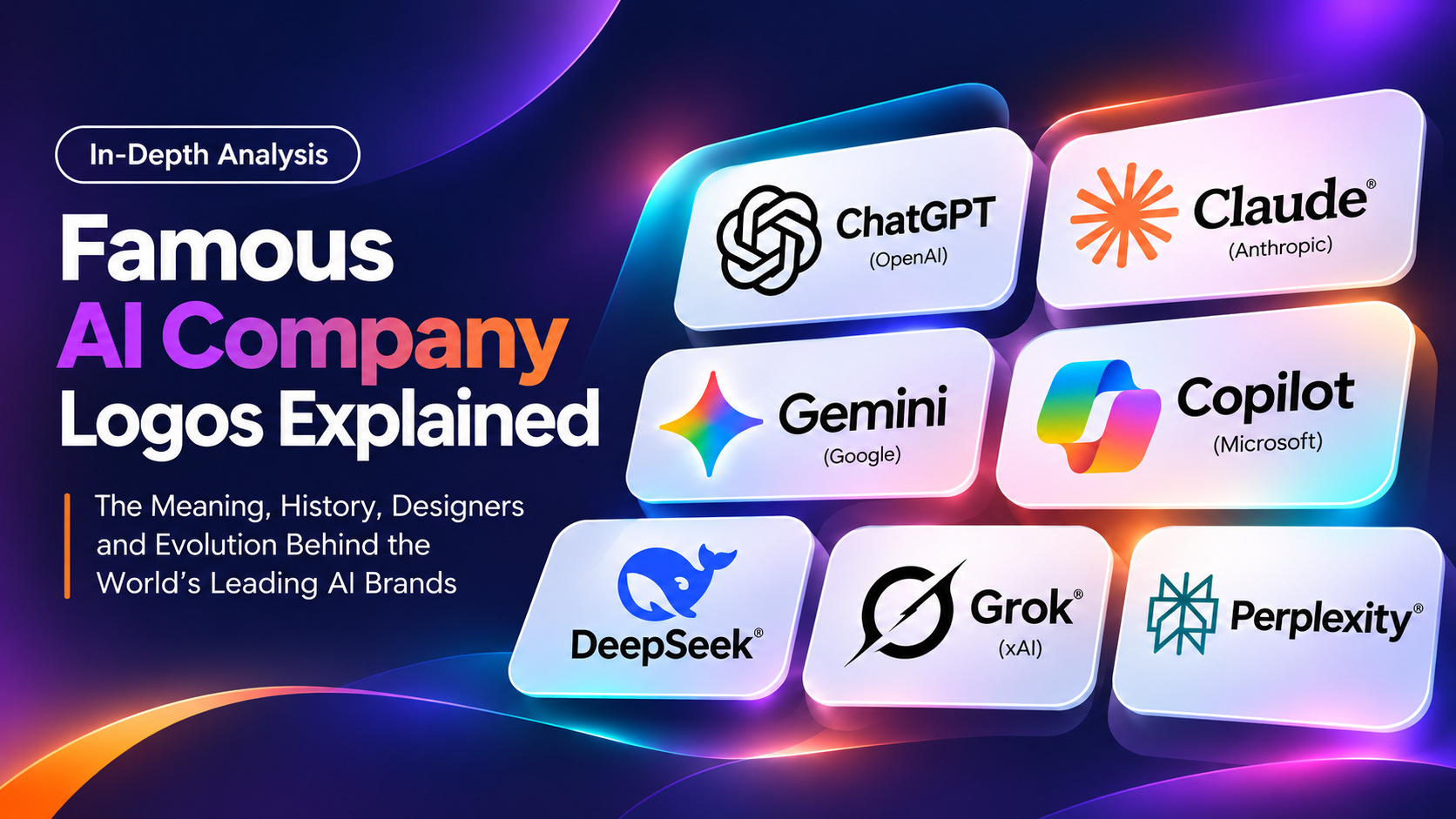
Famous AI Company Logos Explained: ChatGPT, Claude, Gemini & More
The Meaning, History, Designers, and Evolution Behind the World’s Leading AI Brands
Artificial intelligence is transforming the technology industry, but there is another fascinating story unfolding alongside its rapid development: the evolution of AI company logos.
From ChatGPT’s interwoven geometric symbol and Claude’s orange starburst to Google Gemini’s colorful sparkle and DeepSeek’s friendly blue whale, the world’s leading AI brands have developed remarkably different visual identities.
These designs are not merely decorative. They help people recognize products, distinguish competing services, and develop impressions about the companies behind increasingly sophisticated technology.
But what do these famous AI company logos actually mean? Who designed them? When were they introduced? Why do some brands favor minimalist geometry while others use expressive colors, illustrations, or unconventional symbols?
In this detailed guide, we explore the history, symbolism, designers, typography, colors, and evolution of seven recognizable AI company and product identities:
- ChatGPT and OpenAI
- Claude and Anthropic
- Google Gemini
- Microsoft Copilot
- DeepSeek
- Grok
- Perplexity AI
We also examine the branding principles behind these designs and what businesses can learn from them when developing a professional visual identity.
Editorial note: This article distinguishes officially documented design explanations from independent visual interpretations. Some companies have not publicly identified the individual designers of their logos.
1. ChatGPT and OpenAI Logo: Meaning, History, and Designer
Company: OpenAI
Founded: 2015
ChatGPT launched: November 30, 2022
Recognizable symbol: OpenAI Blossom
Major identity refresh: February 2025
What Does the ChatGPT Logo Look Like?
The symbol associated with ChatGPT is one of the most recognizable visual identities in artificial intelligence.
It features six interwoven, looping elements arranged around a central hexagonal opening. Its repeated geometry creates an intricate yet balanced appearance.
Depending on how someone interprets the shape, the symbol can resemble a knot, interconnected ribbons, or a geometric flower.
Its distinctive construction makes it recognizable even without the company name.
However, it is important to understand that the familiar symbol is part of OpenAI’s wider corporate identity, not simply an illustration created exclusively for ChatGPT.
When Was the OpenAI Logo Created?
OpenAI was established in December 2015, years before ChatGPT became a household name.
The company’s recognizable geometric identity predates ChatGPT’s public launch in November 2022.
As ChatGPT gained widespread attention, the symbol became closely associated with conversational artificial intelligence.
In February 2025, OpenAI introduced a comprehensive visual identity refresh.
Rather than abandoning its established symbol, the company refined its geometry and integrated it into a more consistent branding system.
Who Designed the ChatGPT and OpenAI Logo?
Reporting on OpenAI’s 2025 rebrand attributes the original logo to OpenAI co-founders Sam Altman and Ilya Sutskever.
The 2025 refresh was led by an internal design team headed by Veit Moeller and Shannon Jager.
The project also involved external creative specialists, including Studio Dumbar and type foundry ABC Dinamo.
This distinction matters because the original symbol and the later brand refinement were separate design efforts.
What Does the OpenAI Logo Mean?
OpenAI officially calls its symbol the Blossom.
According to the company’s brand guidelines, the Blossom represents the intersection of humanity and technology.
The circular elements communicate fluidity and warmth associated with human-centered thinking.
The right angles introduce the structure and precision associated with technology.
Together, these visual characteristics express a relationship between technical systems and human experiences.
The logo’s repeated, interconnected forms also suggest continuity and collaboration from a visual-design perspective.
However, claims that its six loops represent six specific AI capabilities or that the symbol contains a hidden mathematical message should not be treated as established facts without supporting evidence.
Why Was the OpenAI Logo Redesigned in 2025?
As OpenAI expanded its products and global recognition, its visual identity needed greater consistency.
The refreshed Blossom introduced more uniform line thickness, refined geometry, and improved internal proportions.
The company also developed OpenAI Sans, a custom typeface designed to balance geometric precision with an approachable character.
Its wordmark uses carefully considered letterforms, including a circular O.
The broader identity introduced more consistent typography, visual spacing, and design guidelines.
Logo Design Lessons from OpenAI
The OpenAI identity demonstrates that a recognizable logo does not necessarily need to be replaced during a rebrand.
Sometimes, subtle adjustments can produce a more professional result.
Its strongest lessons are consistency, distinctive geometry, scalability, and the importance of integrating typography into a complete brand system.
For established businesses, this is particularly relevant: preserving valuable brand recognition can be just as important as introducing something new.
Official reference: OpenAI Brand Guidelines
2. Claude and Anthropic Logo: The Story Behind the Orange Starburst
Company: Anthropic
Founded: 2021
Claude publicly introduced: 2023
Recognizable symbol: Orange starburst
Known early branding partner: Geist
What Does the Claude Logo Look Like?
Claude uses a distinctive orange starburst composed of multiple radiating strokes.
The symbol is expressive, relatively simple, and visually different from the symmetrical geometry used by many other technology brands.
Its shape resembles an asterisk, a burst of light, or a stylized sun.
The warm orange color gives the mark a recognizable personality.
Unlike the more formal appearance of some AI company logos, Claude’s identity feels energetic and approachable.
When Was the Claude Logo Introduced?
Anthropic was founded in 2021 by former OpenAI researchers and colleagues.
Claude became publicly available in 2023.
The product’s visual identity developed alongside Anthropic’s early branding and subsequent expansion.
The exact original creation date of the current Claude starburst has not been conclusively documented in the public sources reviewed.
Therefore, the company’s founding date and Claude’s launch date should not be confused with a verified logo-design date.
Who Designed the Claude Logo?
Design studio Geist worked extensively with Anthropic on its early corporate identity.
According to Geist’s published case study, the studio collaborated with Anthropic for approximately two and a half years, developing the brand’s visual identity, typography, color system, digital presence, and related creative materials.
Geist designed Anthropic’s typographic identity, including its distinctive slash detail.
The studio explains that this slash references the code underlying artificial intelligence.
However, the available documentation does not conclusively identify the individual designer responsible for the current Claude starburst.
It would therefore be inaccurate to assign the starburst to a specific person without further evidence.
What Does the Claude Logo Mean?
Claude’s symbol can be visually interpreted as a spark, burst of creativity, or radiating source of energy.
Its multiple strokes create an impression of movement and expansion.
These associations fit naturally with an AI assistant designed to support writing, reasoning, analysis, and creative work.
Nevertheless, Anthropic has not published a definitive explanation assigning a specific symbolic meaning to every individual stroke.
The most reliable interpretation comes from the company’s broader branding philosophy.
Geist describes Anthropic’s identity as an attempt to combine technical sophistication with human values and warmth.
That objective is reflected in the approachable character of Claude’s visual presentation.
Why Is Claude’s Logo Orange?
Orange distinguishes Claude from the blue, purple, and monochromatic identities commonly found in technology branding.
Warm colors can communicate friendliness, creativity, and energy.
Claude’s orange mark also provides strong visual contrast against light interfaces.
The brand does not need a complicated illustration to establish recognition. Its distinctive shape and consistent color already do much of that work.
What Can Designers Learn from Claude?
Claude demonstrates that advanced technology does not always require a futuristic-looking identity.
An expressive symbol, thoughtful typography, and a warm color palette can make a technically sophisticated product feel accessible.
The broader lesson is that visual personality can be a meaningful competitive advantage.
Design reference: Geist — Anthropic Brand Identity
3. Google Gemini Logo: Meaning, Design History, and Evolution
Company: Google
Gemini model family announced: December 2023
Bard renamed Gemini: February 2024
Recognizable symbol: Four-pointed spark
Major color update: 2025
What Does the Google Gemini Logo Look Like?
Google Gemini uses a four-pointed sparkle symbol.
The mark features curved, tapered points that expand outward from a central intersection.
Its distinctive silhouette resembles a flash of light or a moment of discovery.
Earlier versions prominently featured blue and purple gradients.
In 2025, Google introduced a more colorful version incorporating the familiar Google palette.
When Was the Gemini Logo Introduced?
Google announced the Gemini model family in December 2023.
In February 2024, the company renamed its Bard conversational assistant Gemini.
This transition brought the product identity more closely into alignment with Google’s wider AI strategy.
The Gemini spark subsequently appeared across consumer-facing AI experiences.
In June 2025, Google began introducing a revised multicolored version.
The company later confirmed that the updated spark formed part of a wider effort to bring brighter gradient treatments across its brand ecosystem.
Who Designed the Google Gemini Logo?
The Gemini identity was developed within Google’s design and branding organization.
However, the official materials reviewed do not establish one named individual as the definitive creator of the original Gemini spark.
As with many major technology companies, product identities are often developed through collaboration among brand designers, product teams, and creative leadership.
Without a verified individual credit, assigning the logo to a particular designer would be speculative.
What Does the Gemini Logo Symbolize?
Google refers to the symbol as the Gemini spark.
The four-pointed shape visually suggests discovery, illumination, and creative possibility.
These are reasonable design interpretations, but they should not be confused with a detailed official explanation of each point.
The more clearly documented symbolism relates to the brand’s colors.
Google has explained that its brighter four-color gradients represent innovation and creative energy in the AI era.
Why Did Google Change the Gemini Logo Colors?
Gemini originally maintained a distinct blue-purple identity.
As the assistant became more closely integrated with Google’s wider ecosystem, a stronger visual relationship with the parent brand became useful.
The multicolored update connects Gemini to the recognizable Google palette.
This creates familiarity for users who already interact with Google’s other products.
The redesign also demonstrates a principle known as brand architecture.
When a company operates multiple services, shared visual elements can help communicate that those products belong to the same family.
Why Does the Gemini Logo Work at Small Sizes?
The four-pointed spark has a compact silhouette.
Even when displayed as a mobile application icon, its overall shape remains relatively easy to identify.
Its curved points create a distinctive appearance without requiring detailed illustration.
This is an important advantage in modern logo design.
A symbol must work on everything from a large website banner to a small app icon.
Logo Design Lessons from Google Gemini
Gemini illustrates the power of a simple shape supported by an established color system.
It also shows how brand identities can evolve as products become more deeply integrated into a larger company.
For businesses with multiple services or sub-brands, maintaining a coherent visual family can strengthen recognition.
Official reference: Google’s Updated Visual Identity
4. Microsoft Copilot Logo: The Visual Identity of an AI Assistant
Company: Microsoft
Microsoft 365 Copilot announced: March 16, 2023
Recognizable design: Flowing, multicolored abstract forms
Documented design leadership: Microsoft Design
What Does the Microsoft Copilot Logo Look Like?
Microsoft Copilot has used colorful, flowing abstract shapes that suggest movement and flexibility.
Its ribbon-like visual language differs from traditional corporate monograms.
The combination of gradients and overlapping forms gives the identity a dynamic appearance.
It also allows the symbol to connect naturally with Microsoft’s broader family of digital products.
When Was the Microsoft Copilot Logo Introduced?
Microsoft announced Microsoft 365 Copilot in March 2023.
The company subsequently expanded Copilot branding across Windows, Microsoft 365, and other products.
As these experiences developed, Copilot’s visual identity continued to evolve.
This is important because the name Copilot has appeared in multiple Microsoft contexts, and its iconography has not remained completely unchanged.
Who Designed the Microsoft Copilot Logo?
Microsoft’s official design publication includes an extensive article titled Behind the Design: Meet Copilot, authored by Jon Friedman and Kurtis Beavers.
The article explains the design philosophy and product experience behind Copilot.
However, the article’s authorship should not be treated as proof that those individuals personally drew every version of the logo.
Copilot’s identity was developed within Microsoft’s broader design organization.
What Does the Copilot Logo Mean?
The name Copilot provides the clearest explanation of the brand’s positioning.
Rather than presenting artificial intelligence as a system that replaces the user, the name suggests assistance and collaboration.
Microsoft’s design philosophy emphasizes human control, appropriate trust, and interaction with AI as a supporting tool.
Its visual identity helps users recognize when AI capabilities are active within software.
Color, iconography, and interface elements therefore play both branding and functional roles.
Why Does Copilot Use Multiple Colors?
Multicolored visual elements can communicate flexibility, creativity, and activity.
They also create a connection with Microsoft’s established design ecosystem.
Microsoft Design explains that vibrant accents and product colors help distinguish AI interactions from surrounding interface elements.
This is a particularly interesting example of branding supporting usability.
The logo and related visual elements help communicate not only which product someone is using, but also when AI functionality is involved.
What Designers Can Learn from Microsoft Copilot
Copilot demonstrates that a brand identity should be designed for the environments in which people actually encounter it.
For software products, the logo cannot be considered separately from interface design.
A successful visual system should support recognition, usability, and consistency across multiple applications.
Official reference: Microsoft Design — Behind the Design: Meet Copilot

5. DeepSeek Logo: Why This AI Company Uses a Blue Whale
Company: DeepSeek
Founded: 2023
Recognizable symbol: Blue whale
Major international recognition: January 2025
Original logo designer: Not publicly confirmed
What Does the DeepSeek Logo Look Like?
DeepSeek uses a friendly blue whale as its primary recognizable symbol.
Unlike the abstract geometric identities of many competing AI companies, DeepSeek’s logo features an identifiable animal.
The whale has a rounded, approachable appearance.
Its blue color and playful silhouette make the design stand out among more formal technology brands.
When Was the DeepSeek Logo Introduced?
DeepSeek was founded in 2023.
Its blue whale became widely recognizable during the company’s rapid rise to international attention in January 2025.
However, widespread recognition is not the same as the original design date.
The precise creation date of the whale symbol has not been conclusively established in the sources reviewed.
Who Designed the DeepSeek Logo?
The individual designer responsible for the original DeepSeek whale has not been reliably identified in publicly available documentation.
Although the logo has attracted considerable attention from design publications, those articles do not establish a definitive creator.
What Does the DeepSeek Whale Symbolize?
The whale offers several possible visual associations.
Whales are frequently connected with intelligence, depth, navigation, and exploration.
These ideas fit naturally with the name DeepSeek.
The image of a whale moving through a vast ocean can also serve as a metaphor for navigating complex information.
However, DeepSeek has not publicly confirmed a complete symbolic explanation of its logo.
In January 2025, Fast Company examined the whale’s branding potential and quoted design professionals discussing its possible associations.
These observations are valuable as expert interpretation, but they should not be presented as official statements from DeepSeek.
Why Is DeepSeek’s Logo So Different?
Many AI companies use abstract symbols, gradients, and interconnected geometric patterns.
DeepSeek chose a recognizable animal.
That decision creates immediate visual differentiation.
Its friendly character also makes the product feel more approachable.
The design has practical limitations, however.
Small details, such as the whale’s eye, can become difficult to distinguish at reduced sizes.
This demonstrates that a memorable concept still needs careful technical execution.
What Designers Can Learn from DeepSeek
DeepSeek shows how breaking away from industry conventions can strengthen brand recognition.
When competitors look similar, an unconventional symbol may be more memorable.
But differentiation should always support the brand’s identity and remain practical across different applications.
Reference: Fast Company — Why DeepSeek’s Logo Represents a New Era of AI Branding
6. Grok Logo: Minimalism, Redesigns, and Symbolism
Product: Grok
Originally developed by: xAI
Introduced: 2023
Visual style: Minimalist, monochromatic
Notable redesign: February 2025
What Does the Grok Logo Look Like?
Grok has used several minimalist identities during its development.
Earlier marks featured angular and slash-like elements.
A later version introduced a circular form with a diagonal element cutting across it.
The result is a high-contrast, black-and-white symbol.
Its visual language differs significantly from the colorful branding of Gemini and Copilot.
When Was the Grok Logo Created?
Grok was introduced in 2023.
Its branding evolved through multiple iterations during 2024 and 2025.
A notable redesign appeared in February 2025.
The updated mark introduced a more distinctive circular composition.
Because Grok has used multiple versions, references to the “original Grok logo” should identify the specific design being discussed.
Who Designed the Grok Logo?
The complete authorship history of Grok’s various logo versions is not consistently documented in the reviewed public sources.
For that reason, the designs should not be attributed to one named individual without further verification.
What Does the Grok Logo Mean?
The circular version has often been interpreted as resembling a black hole or singularity.
That interpretation fits the product’s association with advanced technology and scientific exploration.
However, a complete official explanation of every geometric element has not been established.
From a design perspective, the logo communicates simplicity and contrast.
Its limited number of elements makes proportion and visual balance particularly important.
Why Does Grok Use Black and White?
Monochromatic branding can be flexible and recognizable.
It avoids dependence on a particular color combination.
A strong black-and-white symbol can also work effectively across light and dark interfaces.
However, extreme simplicity has challenges.
When a logo consists of only a few shapes, small adjustments to spacing or angles can dramatically change its appearance.
What Designers Can Learn from Grok
Grok demonstrates that minimalism requires precision.
A simple symbol may appear easy to create, but developing an original, balanced, and recognizable mark can require extensive refinement.
The strongest minimalist identities work because their proportions and silhouettes have been carefully considered.
7. Perplexity AI Logo: A Geometric Identity for AI Search
Company: Perplexity AI
Founded: 2022
Recognizable symbol: Angular, interconnected geometric mark
Visual style: Minimalist and structured
Original logo designer: Not conclusively identified
What Does the Perplexity Logo Look Like?
Perplexity uses a distinctive geometric mark composed of intersecting lines and angular forms.
Its structure feels architectural and carefully organized.
Unlike DeepSeek’s illustrated whale or Claude’s expressive starburst, Perplexity relies on a more technical visual language.
The logo is compact and works well within a search-oriented digital interface.
When Was the Perplexity Logo Introduced?
Perplexity was founded in 2022.
Its identity developed alongside the company’s AI-powered search and research products.
The exact original creation date of the current geometric symbol has not been conclusively established in the sources reviewed.
Who Designed the Perplexity Logo?
The individual responsible for the original Perplexity symbol has not been definitively identified through the public materials reviewed for this article.
It would therefore be inappropriate to assign authorship without supporting documentation.
What Does the Perplexity Logo Mean?
The interconnected geometric structure can be interpreted as suggesting information, organization, and relationships between ideas.
These associations fit naturally with a platform focused on research and answering questions.
However, such interpretations should not be confused with officially confirmed symbolism.
Its most obvious visual qualities are structure, symmetry, and compactness.
Why Does the Perplexity Logo Work?
The design avoids obvious illustrations of search, such as magnifying glasses.
Instead, it creates a distinctive abstract symbol.
This allows the identity to remain relevant even as the product develops additional capabilities.
The logo also demonstrates how a relatively simple mark can communicate a serious, research-oriented personality.
What Designers Can Learn from Perplexity
A company does not need to illustrate its service literally.
A memorable abstract symbol can offer greater flexibility and longevity.
The challenge is creating something distinctive enough to avoid becoming another generic geometric icon.
AI Company Logos Comparison: Design, Meaning, and History
Each of these companies has developed a recognizable visual personality.
| AI Company or Product | Logo Symbol | Main Colors | Important Milestone | Designer Information |
|---|---|---|---|---|
| ChatGPT / OpenAI | Interwoven Blossom | Black and white | 2025 identity refresh | Original attributed to Altman and Sutskever; refresh led by Moeller and Jager |
| Claude / Anthropic | Radiating starburst | Orange | Claude introduced in 2023 | Geist documented for early Anthropic identity; starburst creator not confirmed |
| Google Gemini | Four-pointed spark | Multicolor gradient | 2025 color update | Individual creator not confirmed |
| Microsoft Copilot | Flowing abstract forms | Multicolor | Copilot introduced in 2023 | Microsoft Design organization |
| DeepSeek | Whale | Blue | Global attention in 2025 | Individual creator not confirmed |
| Grok | Minimal circular mark | Black and white | 2025 redesign | Complete authorship not confirmed |
| Perplexity | Interconnected geometry | Dark and teal treatments | Founded in 2022 | Individual creator not confirmed |
The comparison reveals an important principle: successful AI company logos do not all follow the same design formula.
Some prioritize warmth. Others emphasize structure, movement, familiarity, or differentiation.
Their effectiveness depends on how well the identity supports the brand.
Why Do So Many AI Companies Use Abstract Logos?
Artificial intelligence is difficult to represent visually.
Unlike a restaurant, construction company, or clothing brand, an AI business may not have a physical product that can easily be illustrated.
A robot head or brain symbol may communicate technology, but these images have become common and can feel generic.
Abstract identities provide several advantages.
They Represent Broad Capabilities
AI companies often offer multiple products and services.
A symbol tied to one narrow feature may become less relevant as the business expands.
Abstract marks can represent a wider company mission.
They Work Across Digital Platforms
Modern technology logos appear on websites, mobile applications, browser tabs, software interfaces, and social media.
Compact geometric symbols can be adapted to these environments more easily than complicated illustrations.
They Support Long-Term Recognition
A distinctive shape can become recognizable even without a company name.
This is especially valuable for brands with global audiences.
They Allow Flexible Brand Systems
Abstract marks can be combined with typography, color palettes, animation, and interface elements.
This makes them suitable for companies whose products continue to evolve.
However, abstraction alone does not guarantee originality.
When too many brands use similar geometric patterns, differentiation becomes more difficult.
Color Psychology in AI Company Logo Design
Color plays an important role in brand recognition.
But color psychology is not a universal formula. Meanings can vary depending on culture, context, and individual experience.
The effectiveness of a color depends on how it supports the broader identity.
Black and White: Simplicity and Precision
OpenAI and Grok demonstrate how monochromatic identities can create recognition through shape and contrast.
Black-and-white marks can also be versatile across different backgrounds.
Orange: Warmth and Creativity
Claude’s orange identity creates a warmer impression than conventional corporate technology branding.
Its color helps distinguish the product within a crowded market.
Blue: Familiarity and Approachability
DeepSeek’s blue whale combines a familiar technology color with a playful illustrated symbol.
The result feels different from a conventional blue corporate logo.
Multicolor: Creativity and Adaptability
Gemini and Copilot use multiple colors to support energetic, flexible visual identities.
In Gemini’s case, the colors also strengthen its relationship with Google’s wider brand.
The central lesson is that a successful palette should reinforce a company’s personality and positioning.
Who Designs Famous AI Company Logos?
A common misconception is that every famous company logo has one publicly recognized creator.
In reality, major identities are often developed by teams.
A complete branding project may involve:
- Creative directors
- Brand identity designers
- Typography specialists
- Product designers
- Motion designers
- Design studios
- Internal marketing teams
Some companies publicly document their creative partners.
Others reveal only limited information about the original design process.
For example, OpenAI’s 2025 refresh has documented design leadership, while Geist has published a detailed case study about Anthropic’s early identity.
For several other AI logos, individual authorship remains unconfirmed.
Responsible design-history reporting should acknowledge these gaps rather than invent names.
It is also important to distinguish between the creator of a company’s original logo and the team responsible for a later redesign.
What Makes an AI Company Logo Successful?
Despite their differences, recognizable AI company logos share several design characteristics.
1. A Distinctive Silhouette
Strong logos remain identifiable without relying entirely on color.
The OpenAI Blossom and Gemini spark demonstrate the value of memorable geometry.
2. Scalability
A professional logo should work at different sizes.
A mark that looks impressive on a presentation slide may fail when reduced to a small application icon.
3. Consistency
Recognition grows when a brand applies its visual identity consistently.
Typography, colors, spacing, and icon usage should follow clear guidelines.
4. Originality
A logo should distinguish a company from its competitors.
Copying popular design trends can weaken that distinction.
5. Brand Relevance
The strongest identities support the personality and positioning of the business.
A playful character may suit one brand, while a restrained geometric symbol may suit another.
6. Long-Term Flexibility
Businesses change over time.
A well-developed identity should remain useful as products, services, and audiences expand.
AI Logo Generators vs. Professional Custom Logo Design
The rapid development of artificial intelligence has also introduced new tools for generating logos.
AI-powered platforms can produce visual concepts quickly, making them useful for brainstorming and early inspiration.
However, generating a visually appealing image is not the same as creating a complete professional brand identity.
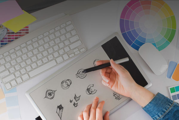
A custom logo design process involves research, creative direction, concept development, typography, geometric refinement, and technical preparation.
Originality and Brand Differentiation
AI-generated concepts may resemble existing designs or rely on familiar visual patterns.
Professional designers evaluate how a proposed identity compares with competitors and whether it communicates the intended brand personality.
Typography and Visual Balance
AI-generated artwork may contain inconsistent lettering, spacing, or proportions.
Professional logo development requires careful attention to these details.
Vector Quality and Scalability
A business logo should be suitable for different sizes and production methods.
Clean vector artwork is especially important for print, signage, and other applications.
Brand Identity Beyond the Logo
A logo alone does not create a complete brand.
A cohesive identity includes typography, color systems, imagery, stationery, digital applications, and consistent visual guidelines.
Trademark Considerations
Businesses should investigate potential conflicts with existing trademarks before adopting a new identity.
Neither AI-generated artwork nor professionally designed artwork automatically guarantees trademark availability.
Appropriate legal review may be necessary.
The Value of Custom Logo Design
At DigiHexagon, we approach logo design as a strategic creative process.
The goal is to create an identity that reflects a company’s personality, industry, audience, and long-term vision.
Rather than relying on generic templates, custom logo design allows businesses to develop a distinctive visual presence.
A strong logo should not simply look attractive.
It should be recognizable, versatile, and appropriate for the business it represents.
Frequently Asked Questions About AI Company Logos
What is the most recognizable AI company logo?
ChatGPT’s interwoven OpenAI Blossom is among the most widely recognized AI-related symbols. However, identifying a single most recognizable logo would require reliable brand-awareness research.
Who designed the ChatGPT logo?
The original OpenAI symbol has been attributed to Sam Altman and Ilya Sutskever. The company’s 2025 brand refresh was led by Veit Moeller and Shannon Jager.
What does the OpenAI logo symbolize?
OpenAI officially describes its Blossom as representing the intersection of humanity and technology, combining circular warmth with geometric precision.
Who designed the Claude logo?
Geist developed Anthropic’s early visual identity. The individual creator of the current Claude starburst has not been conclusively identified in the reviewed documentation.
Why is Claude’s logo orange?
Orange gives Claude a distinctive, warm visual identity. Broader interpretations involving creativity and approachability are design observations rather than a complete official explanation.
What does the Google Gemini logo mean?
Google calls its four-pointed symbol the Gemini spark. Its updated multicolor identity connects Gemini with Google’s broader brand system.
Why did Google change the Gemini logo?
Google introduced a four-color Gemini spark in 2025 as part of a broader visual update emphasizing consistency and creative energy across its products.
What animal is in the DeepSeek logo?
DeepSeek uses a blue whale.
What does the DeepSeek whale represent?
The whale can suggest intelligence, exploration, and depth, although DeepSeek has not published a definitive explanation confirming every symbolic interpretation.
Why does Grok use a black-and-white logo?
Its monochromatic design creates a minimalist, high-contrast appearance. The exact reasoning behind every design decision has not been fully documented publicly.
Who designed the Perplexity AI logo?
The individual designer of the original geometric symbol has not been conclusively identified in the public sources reviewed.
Can AI generate professional logos?
AI tools can assist with concept generation, but professional brand development still requires originality assessment, typography refinement, technical preparation, and strategic design judgment.
Final Thoughts: What Famous AI Company Logos Teach Us About Branding
The logos of ChatGPT, Claude, Gemini, Copilot, DeepSeek, Grok, and Perplexity demonstrate that successful branding does not depend on one visual style.
OpenAI emphasizes interconnected geometry and refinement.
Claude combines an expressive symbol with a warm color palette.
Google Gemini uses a recognizable spark supported by a familiar corporate color system.
Microsoft Copilot demonstrates how visual identity can work across multiple software environments.
DeepSeek stands apart through its approachable whale illustration.
Grok relies on high-contrast minimalism.
Perplexity uses structured geometry to establish a distinctive research-oriented identity.
Each approach reflects different design priorities.
For businesses developing their own brand identity, the most valuable lesson is simple: a memorable logo should be created around the business, not around a passing design trend.
A professional logo should communicate a distinctive personality, remain recognizable across different applications, and support long-term brand growth.
Need a Professional Custom Logo for Your Business?
DigiHexagon specializes in custom logo design, brand identity, and creative design services for startups, entrepreneurs, and established businesses.
Whether you’re launching a new company or refreshing an existing brand, our goal is to create a distinctive identity that represents your business.
Explore our Custom Logo Design Services and start building a brand that stands out.




 +1 484-778-4600